Multiversus went through some significant changes with its transition from open beta to full version, and fans are rather less pleased.

Multiversus was released on July 19, 2022, and after a long time in Open Beta, it's finally available in its full version. Even though the Beta is now over, we can still look forward to many more updates and new content.
With the full version of a game, developers usually implement some significant changes, and Multiversus is no exception. While some changes have been met with approval, others have been more contentious. Let's take a closer look at these changes.
Multiversus: Changes From Beta To Full Version

New game update, new luck – or should we say misfortune in this case? Many changes for the full version, as opposed to the open beta, have not been well received by players. Therefore, many players are hoping for quick adjustments. But what exactly has been changed?
Combat Speed
The most significant difference from the beta is the change in combat speed. The game feels slower overall, with movements, animations, and even hit stun appearing much slower. While we understand that the developers had to rebuild the game from scratch in the UE5 Engine, it doesn't fully explain the drastic reduction in speed!
For new players, the game may now seem more user-friendly and accessible. However, for returning players, it feels like moving at a snail's pace. Hopefully, the speed will be adjusted to create a more balanced experience for both new players and those already familiar with the game.
Camera Zoom
Another very noticeable change is the zoom setting. In the beta, the camera was set further away, giving players a clear overview of the fights. In the full version, the view is now much closer. While this allows us to see the fights and characters in greater detail, it quickly becomes cluttered, especially with larger characters or during 2v2 fights.
For players who prefer detailed visuals over a broad view of the fight and battlefield, this setting is fantastic. However, it has not been well received by most fans, who hope for a return to a more expansive overview.
More Effort For Fewer Rewards
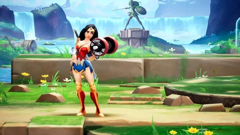
If one thinks that obtaining content becomes easier with the full version, they are mistaken. While the new version does offer more content, it also requires much more grinding to access it. Players now have to invest a significant amount of time in the game or spend a large sum of money to unlock certain items and content.
It's not just about time or money – even with the Rifts, character masteries, and collecting Perk Points, the grind has increased significantly. Without this effort, players have little chance of unlocking new characters. Some may appreciate the challenge, but the majority are not convinced and are calling for a change as soon as possible.
Graphical Fidelity
And after addressing so many criticisms, let's talk about a truly great aspect: the graphical quality has significantly improved! This is mainly due to the switch from Unreal Engine 4 to UE5, allowing the developers to render textures more sharply and give them a bit of 'polish,' as they say in developer jargon.
But it's not just the graphics that have received a considerable upgrade; the game itself has also seen improvements with a new game mode, a sleek layout, a new system, and much more. Of course, there are still some errors, bugs, and rough elements, but what game doesn't have those?
New Game Mode
With the transition from the Open Beta to the full version, the main game has not only expanded but has also gained a newcomer: the brand-new PvE mode called 'Rifts'. In this mode, players traverse different maps with various stages, battling against a variety of characters. These characters are equipped with various modifiers and missions, adding a bit more challenge to the gameplay.
This game mode is a welcome addition to the main gameplay. While some sections may feel long and drawn out, overall, the new mode is quite enjoyable.
UI Design
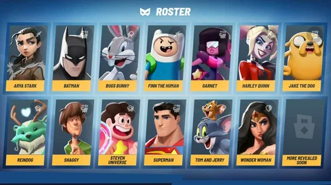
The user interface has suffered significantly with the full release. Navigating through the menu is now quite tedious and confusing. But the worst part is that they removed some useful options from the UI, which has caused a lot of confusion. What were the developers thinking with these changes?
Hopefully, they realize that the changes aren't really well-received by the players and make appropriate adjustments quickly. We're counting on you, Player First Games.
The Perk System
The Perk system has been significantly simplified, or perhaps it’s better to say there used to be more choices available. In the beta, players could choose between red, green, and blue Perks to equip their characters, each offering its own advantages, whether an active effect or a beneficial passive buff.
This system has now been somewhat streamlined in the full release. Each player can now choose between 10 and 15 options for their 3 Perk slots. Some Perks feel like they have no impact on the game, while others like Airwalker are simply too powerful. There is still room for improvement here.
Match Statistics
In the beta, after a match, players were shown their statistics. They could see how much damage they dealt, how much damage they took, how many Ring Outs they achieved, and many other interesting pieces of information. However, with the full release, these details have been significantly simplified or even completely removed.
So, if you're trying to improve your performance now, you can no longer rely on detailed statistics to show you exactly what you need to work on. Instead, you have to figure it out on your own. But the really frustrating part is the new results screen. Now, you can only either watch the rematch or give your opponent a toast. Wouldn't you rather look at your stats?
These are all the changes that the full release brought compared to the beta. What do you think about the changes? Feel free to share your thoughts in the comments.


